
YAXS: Evolution of vistaide.com
Posted by: grosdunordOn 2013/5/12 21:20:00 8095 readsAfter several years of using the same theme, the Website vistaide.com has been updated to a new look.
The arrival of XOOPS 2.6, inspired Grosdunord and Tatane to design a theme based on Bootstrap Twitter while remaining on XOOPS 2.5.x.
The theme is compatible with following browsers: Firefox, Chrome, Opera, Safari, Internet Explorer, and many others, since it is based on responsive design.
So the theme is compatible Mobile, tablet and desktop with different formats below:
Phone: 480px and below
Phone Tablet Landscape portrait: 767 px
shelf vertical to horizontal mode and office: 768 px to 979px
Office: 980 px
Main office: 1200px

To improve performance we used the CSS sprites for images but also minified css html and JavaScripts.
We made some invisible block when switching to mobile mode because we find that these blocks were completely useless in this mode.
Right blocks in mobile mode are automatically placed above the center blocks.
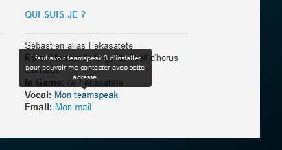
We used the Tooltip for some links as "forgotten password" or the text "Remember me" to give more information on these links to visitors.
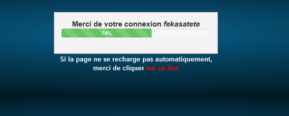
The redirect page uses the Progress Bar with percentage display progress loading it.
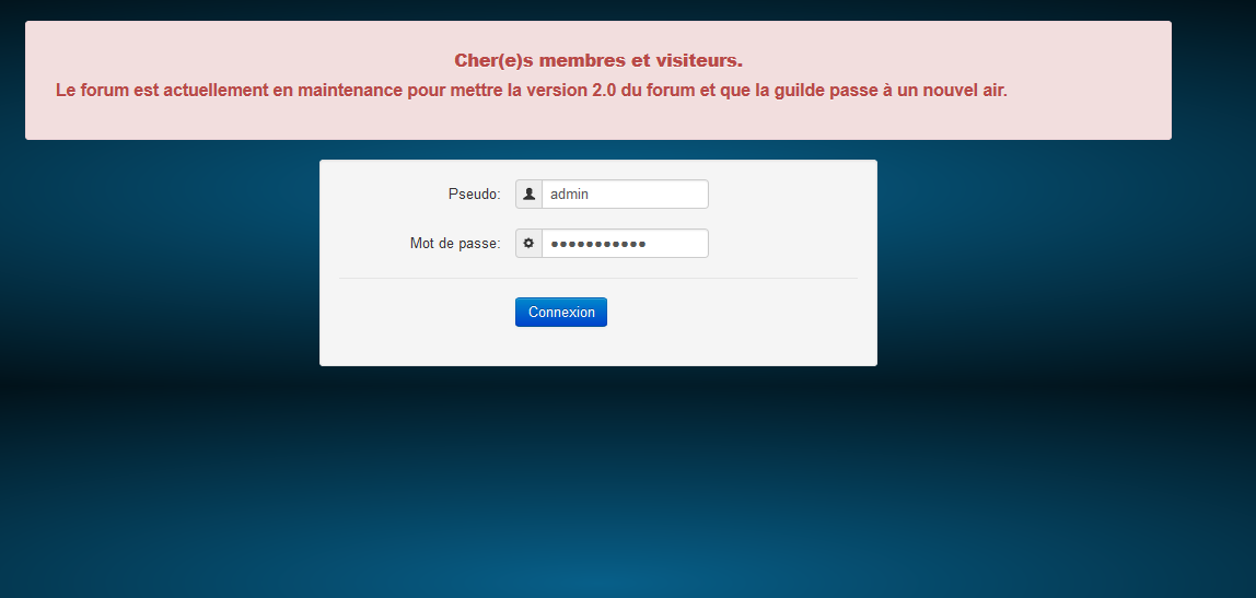
Page "site work" is entirely based on bootstrap

 Re: Evolution of vistaide.com
